
Hierarchy
Share this:
Anytime I critique a design, the very first thing I think about is hierarchy.
hierarchy – an arrangement or classification of things according to relative importance.
What are you trying to say with your design? Is the most important thing, the first thing that I see? If not, then maybe you’re not using hierarchy correctly. Here’s how I do it.
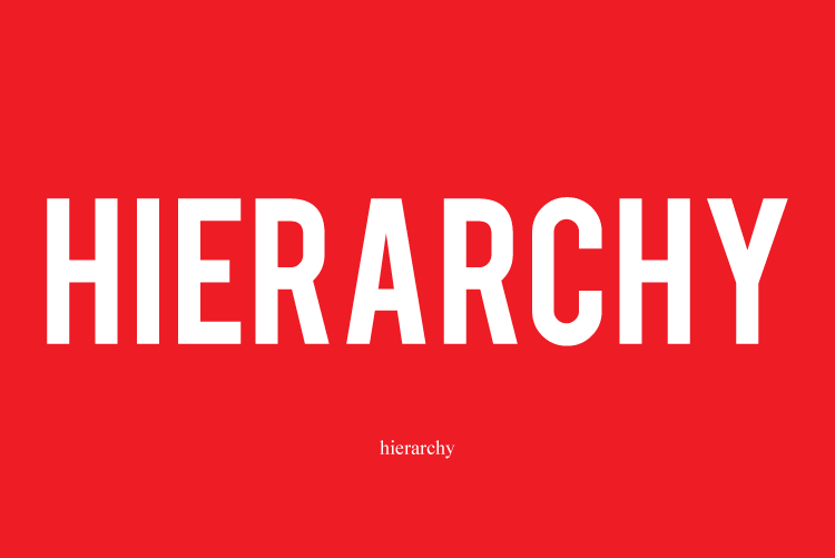
1. Size
The most important thing should be the biggest.
Why? Because you’re going to see the biggest thing first. The end.
2. Reading Order
What’s the order in which your eyes move across the design? Most people read from left to right and from top to bottom. So be mindful of that. Also, depending on your design you can control where the eyes go.
Example: If you put the biggest thing on the bottom, the viewer’s eyes will start from the bottom first.
So always ask yourself, what’s the reading order? And are you using hierarchy so that the viewer is reading the design based on importance.
3. Space
The negative space in your design is just as important as the positive space. Make sure to separate elements from each other. If you put two parts that are completely different right beside each other, the viewer is going to associate them as being the same thing.
Example: On business cards you want to put some space between the logo and the contact information? Why? Because they’re two separate things and should not be close to each other.
4. Typeface
Just look at the logo of The Print Shop. What’s the first thing you see? The word “Print”. Why? Because the word “Print” is in bold. Why did I make “Print” bold and not “Shop”? Because the word “Print” is more important than the word “Shop”. I want people to see the word “Print” first. I also made the word “The” the smallest because it’s the least important of the three.
5. Color
Let’s stick with the logo of The Print Shop. I made the word “Shop” light gray and word “Print” in black. If I had both words black and the same weight, the word “Print” would not stand out as much. Instead I made the word “Print” bold and black. Then I made the word “Shop” thin and light gray. Even though that’s an example between black and gray, you can use color and typeface in order to create hierarchy.
Summary
Design is a form of communication. What makes or breaks a design is how well the design is able to convey a message. When done correctly, hierarchy can be used to make sure that you get that message across to the viewer.