Displaying Text Over Images

Share this:
Text can be incredibly hard to read if the area behind it is not consistent. That’s the reason book pages are plain white and the text is black. When it comes to design, having a visually interesting image can be a massive help when trying to grab peoples’ attention. However, book covers and designs alike are almost always trying to tell you something, not just show you. Fortunately, there are several ways to make text stand out against a mixed background or picture.
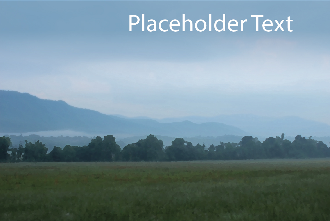
Applying a Gradient
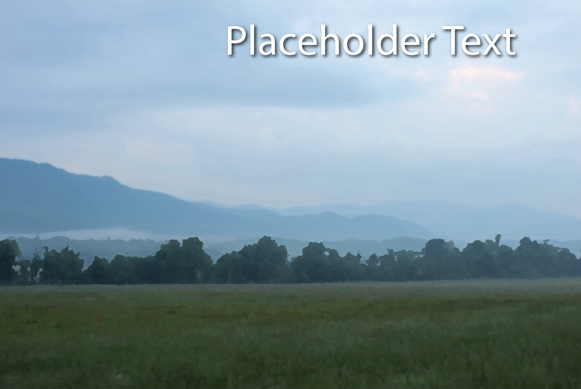
This method works best when the text is near either the top or bottom of the image. It consists of applying a rectangle or other shape behind the text you are displaying. Once the shape is in place and arranged behind the text, you can apply a gradient to it through the “Gradient” tool, which looks as you would expect. It can also be found in the Window Tab. Apply a gradient to the shape by clicking the square in the top left of its window. Now you can manipulate the colors, direction, angle, and opacity of its different aspects. The one seen below is a linear 90 degrees 70% opacity blue to 0% opacity white.
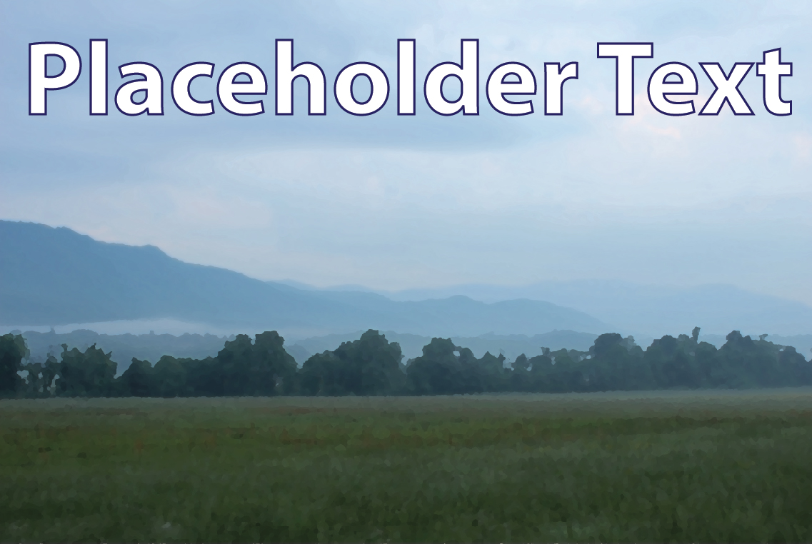
Applying an Outline
Outlines are incredibly easy to do, but can lead to varying degrees of success. For this example, I needed to make the font larger and bold for the outlines to work visually. You can give the text outlines by clicking on the text, then going to the color square on the right in the top left corner. Once you’ve given it an outline you can alter the thickness and style of the outline. Take care not to have the outlines overpower the text.
Applying a Drop Shadow
The Drop Shadow is similar to a gradient but centers around the text, so it can be effective in most areas of the image. You can find it under EffectStylizeDrop Shadow. From there you can manipulate the shadow’s color, the filter it interacts with the image behind it, the general opacity or transparency, and the amount and distance of the blur from the text. To edit the effect, look for the circle surrounded by dots which marks the “Appearance” button or find it under the Window Tab.
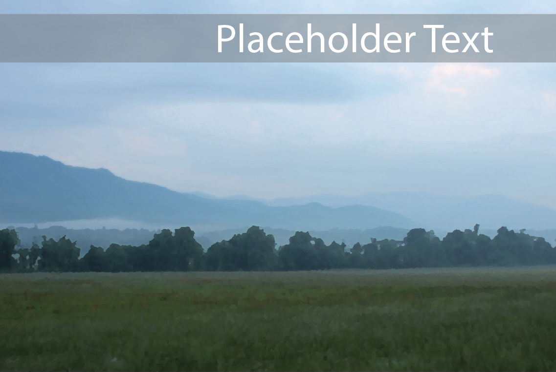
Semi-transparent Background or Solid-color Shape
Another way I like to use is to apply a semi-transparent shape behind the text. It’s a very simple process as it only involves placing the desired shape behind the text and altering the shape’s opacity. You can also use solid colors with 100% opacity just as well. However, this method does not work in all scenarios or locations and can sometimes visually divide your image into unintended sections.